FIFA World Cup 2022: ball, price, design, weight, photos
Football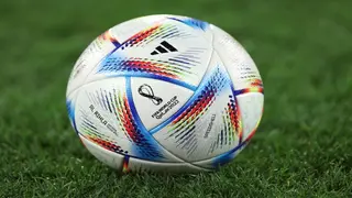
A logo is a graphic mark, emblem, or symbol used to promote and aid public identification and recognition. MLS logos are the emblems or visual representations used by each Major League Soccer franchise. Every team in the league has its logo, which has meaning within the MLS and fulfils various tasks.

Most MLS logos have evolved in line with the success of various teams over the years. They are critical due to their powerful symbols that bond clubs with their followers, symbolise their principles, and contribute to the league's overall spirit.
Remember that opinions on what constitutes the best MLS logos are subjective and that personal preferences differ. According to Impose Magazine, here are all MLS logos and names, ranked according to design, simplicity, adaptability, and uniqueness.
FIFA World Cup 2022: ball, price, design, weight, photos
FootballOnce purchased, the team's name and branding were modified to reflect Red Bull. The current design has two bulls going head-to-head with a soccer ball in the centre, similar to the Red Bull emblem.

Based on a national crest, Real Salt Lake's comparatively traditional logo features a stylized monogram inside a blue shield design.
Gold and blue are the Nashville SC's primary colours, inspired by the many tints of Nashville's flag. The monogram "N" with multiple vertical bars intended to depict sound waves and a golden octagon with a thin outline encases the entire logo.
While the emblem's shape has evolved, the Columbus crew's colours of black and gold have stayed constant. With a black banner surrounded by a golden frame and a stylized "C," this team's new MLS logo design is sleek and contemporary.

NBA's best selling jerseys: Which are the 10 most selling jerseys in basketball?
NBA
Cincinnati has one of the more vibrant MLS logos on our list. The club has a lively image because orange and blue are the team's primary colours. The team's initial crest featured Saint Mark, the Evangelist's winged lion.
The club underwent a rebranding in 2019, and the result is a circular emblem with a big "C" in the centre and a blue border around it. A group of triangles known as the "fire crown" are included in the blue border, signifying Chicago's rebirth after the great fire.
The historic Gateway Arch from St. Louis is featured on a shield-like design in the club's ultra-modern crest. Two of the longest rivers in America are represented by the curving lines. In some lighting conditions, the image's vivid red can easily be mistaken for pink.

Vancouver Whitecaps FC's logo comprises a mountain range depicting a string of diamonds, which is the inspiration behind the design. The overlapping forms represent strength and togetherness.
Liverpool player salaries: Find out the highest paid Liverpool player
Football
The LA Galaxy team and the Earthquakes are bitter rivals, with the former winning two MLS Cup victories. The Quakes' current MLS emblem alludes to their prior crest as an NASL team. The year "1974" draws attention to the preceding squad.
The basic logo's primary colour is green, with golden stripes and a white axe in the centre. The logo, meant to stand for unity and wholeness, includes aspects of the former USL design. An allusion to the forestry business in the Pacific Northwest is the axe.

After the Red Bulls, the team is the second New York-based franchise. The clubs’ colours have mostly stayed the same over the years. The stylized monogram for "New York City" is present in the image today, enclosed by a circular blue frame.
The club was established in 1992 and joined Major League Soccer in 2012 as an expansion franchise. In 2022, the team brought a new logo with blue and black stripes, a stylized Fleur de Lys, and a more contemporary design.
Adidas logo history: The evolution, meaning and history of the Adidas logo
Other Sports
Considering most US soccer teams on this list, the club's logo is intriguing and modern. Minnesota's official bird, the "loon," is stylized and featured in the artwork. Every player on the field is represented by one of the eleven feathers.

The stylized outline of the Kansas–Missouri state boundary is displayed on a teardrop-shaped shield in the Kansas City logo. The picture refers to the team's previous "Wizards" emblem.
The team's emblem has an almost Art Deco design, with a monogram in the centre of a hexagon-shaped badge. The name and design allude to Houston's role in the energy-dependent industrial economy.
The squad finished second in the 2010 MLS Cup and earned its first Supporters' Shield in 2016. A bull picture on the club badge highlights the Texas mascot. The team also uses red, white, and blue to display patriotic nature.
Premier League mascots: Who is the best mascot in the EPL?
Football

The DC logo blends modern style with historical components. An eagle is positioned above a shield-like crest in the illustration. The three stars and the red and white stripes of the design represent the Washington DC flag.
From the beginning, the Rapids MLS logo has seen several changes. The shield in the current design has a burgundy pointed upper part. A mountain range with a soccer ball perched on top is visible in the centre of the design.
Charlotte FC has had one of the best MLS logos through the years. It is a circular badge with a black frame that displays the team name, similar to many other Major League Soccer logos. A white crown on a blue background sits in the centre, signifying greatness and legacy.
The Union obtained the Supporter's Shield in 2020. The thirteen stars on the Philadelphia Union emblem, symbolising the original thirteen colonies, are a nod to the American Revolutionary War.
A comprehensive list of the most iconic basketball player logos
NBA

Like other MLS teams, Orland City's logo is a shield with a gold lion face encircled by twenty-one "flares." The Orlando Lions, Orlando's first professional soccer team, is honoured by the lion emblem and colour combination.
The New England Revolution logo is among the new MLS logos introduced in 2021. It has an "R" and a floral design resembling the Boston Tea Party emblem.
The club attracted much attention after Lionel Messi announced his intention to join the team in 2023. The Miami crest has two birds arranged back to back that, although they resemble flamingos, are white herons. The badge has three colours: pink, white, and black.
The LAFC logo, which features an LA monogram and a shield outline that alludes to the city seal, is influenced by the Art Deco movement, in contrast to many other MLS team emblems. Matthew Wolff designed the logo. LAFC has one of the best MLS logos as of 2023.
From Nike to Adidas: The 10 best sports logos of all time
Other Sports

Austin FC's logo is a shield-shaped design with a curving lower border. The letters "F" and "C" are positioned on either side of a straightforward green tree in the logo's middle. At the top of the brand symbol, the city's name is shown on a banner.
One of the few Canadian clubs in the MLS is the Toronto Football Club, which plays in the Eastern Conference. The team has a standard MLS logo consisting of a striped shield with a decorative accent on top and a banner with "Toronto" written across the middle.
The Sounders are among the league's most successful clubs, with record-breaking game attendance. Their logo is designed as a heraldic shield with two layers, signifying community. A picture of the Space Needle, a well-known landmark in Seattle, is also included.
The club has won a record five cups and is among the top clubs with the best MLS logos. The LA Galaxy team has a reasonably straightforward MLS logo centred on a traditional shield with a four-pointed star in a dark blue and bold design.
The 10 best wrestling outfits of all time: a stylish and iconic countdown
Other Sports
The Atlanta City seal inspired the circle with a large "A" in the centre of the team's emblem, unveiled along with its colours in 2015. It has a set of red and black stripes, which stand for the team's pillars of community, togetherness, determination, innovation, and excellence

The stars are on the logo to represent the MLS brand for the club, country, and community.
The best MLS logos are frequently determined by their simplicity, adaptability, uniqueness, and ability to accurately convey the team's identity and core values. Personal ties to teams may also impact preferences for particular logos. As teams rebrand, rankings are subject to change.
READ ALSO: Famous Cristiano Ronaldo hairstyles through the years
Sports Brief published an article about Cristiano Ronaldo's famous hairstyles. Aside from being among the greatest soccer players of all time, Cristiano Ronaldo is known for his different hair designs.
Physical appearances have been vital in gaining confidence by some of the greatest footballers in history, and Ronaldo is no different. Discover more about Cristiano Ronaldo's hairstyles through the years and determine which is your favourite.